

Hallmark Website Redesign
A three week sprint group project to redesign Hallmark website to leverage a digital or hybrid solution to have more people use their products and services.
Role
This was a group project of four talented designers, done over the course of three working weeks.
We all collaborated throughout all the phases in order to give the best possible user experience at the end.
Approach
-
Website Usability Tests.
-
Heuristic Evaluation.
-
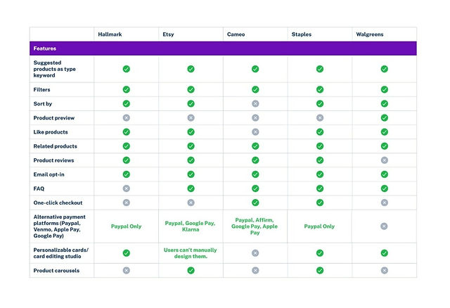
Competitive & Comparative Analysis.
-
User Interviews.
-
Affinity Mapping.
-
Prototyping.
-
Hi-Fi usability testing.
Challenge
Hallmark is the oldest and largest greeting card manufacturer yet their website wasn’t communicating that to their users.
Our goal was to restructure the website to show it’s best potential while having our users needs and goals centered throughout our design process.
Solution
-
Restructure the site map per card sorting finding.
-
Minimize the colors used in the current website to make it a better UI experience.
-
Introduce a new subscription feature.
-
Improve existing Studio per research findings.
The Results
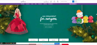
Current Home Page
Proposed Home Page

Project Timeline

We started off with applying few UX research method in order to better understand our users need and pain points using the website as it's now.
Some of the methods we applied to this research were:
-
Competitive Analysis
-
Comparatives analysis
-
Heuristic Evaluation
-
A thorough evaluations to point out areas of improvements and narrow them down to the most critical issues to address first then if time allows we move to the not so critical points.
-
Primary navigation not intuitively grouped
-
Repetitive categories
-
Profile icon is located in the center of the header
-
Large block of text at the bottom of the page describing the product category.
-
-
Card Sorting.
-
User Testing
-
User Interviews
Research Phase
User testing & Interviews Synthesis
Define Phase

Jack is a friendly, family man, around 70 years old, and he wants to connect with his grandchildren more often through a new medium.
Jack is our primary persona.
Say Hi to Jack..
After performing intensive research, it was time to identify our users' needs, paint points & ask ourselves, how might we make their experience better.
We started our define phase with affinity mapping, Restructuring our website map per the card sorting finding then we followed by defining personas,

Amy is very sociable, hard working and busy. Her goal is to shop quickly and efficiently for cards and gifts for her events lined up in her Google Calendar.
Amy is our Secondary Persona
Hi, I'm Amy
Ideate Phase
Now it was time to put our great minds to work and start sketching proposed solutions as possible, we all did few iteration of hand sketches then collaborated to come out with the best solution that we thought would provide our users with and exceptional user experience and at the same time would add value to the business.
After refining our sketches we started wireframing our design, we all worked together to create a mid-fi prototype in order to test our design with actual users.

Home Page Sketches

Mid-Fi prototype for task 1
Mid-Fi
We preformed usability test with 6 users With two separate each task specific to each persona we have.
Task 1:
Find an “add a message” personalized card called, “You're How Old? Funny Birthday Card,” and personalize it, then add it to your cart and checkout.
Task 2:
You recently opened a subscription account at Hallmark, you haven’t fully finished signing up for your new calendar sync feature.
1-Please complete your sign up for the subscription.
2-Choose a gift & card for your friend Sandra’s upcoming baby shower.
Mid-Fi Usability Testing Synthesis
we had few hiccups that we need to tweak before moving to the next phase
Some of this finding were:
_edited.jpg)
Filter:
Issue: Users found there was too many filters categories to choose from.
Solution: Switch to drop down menu.
_edited.jpg)
_edited.jpg)
Filter:
Issue: Users found there was too many filters categories to choose from.
Solution: Switch to drop down menu.
Hi-Fi prototype
After spending some time synthesising our mid-fi testing finding, we worked together to put down solutions and refine our Hi-fi prototype and the result was the following

Jack's Hi-Fi prototype

Amy's Hi-Fi prototype