
Yummy Boutique Website Redesign
A Two week Spec project to redesign Yummy Boutique website, a local e-commerce website, to help them provide a better UX experience for their users and grow their business revenue
Role
This was a solo project
I performed research and design phases through out the project
Approach
-
Website Usability Tests.
-
Heuristic Evaluation.
-
Competitive & Comparative Analysis.
-
User Interviews.
-
Affinity Mapping.
-
Prototyping.
-
Hi-Fi usability testing.
Challenge
The website as it’s now was overwhelming and needed to be restructured and organized.
They don’t show any hierarchy through out the website
Solution
-
Restructure the site map per card sorting finding.
-
Ux and UI improvement to the full website
The Results
Current Home Page

Proposed Home Page

How Can We Help
Research
-
Usability testing
-
Users interviews
-
Heuristic Evaluation
-
Competitive & comparative analysis
Design
-
Layout Sketches
-
Wireframes
-
Mid-fidelity Prototype
Define
-
User persona
-
Journey map
-
Problem statement & HWM
-
User flows
-
Navigation Design
Deliver
-
Hi-FI Prototype
-
Usability testing
-
Testing result Synthesis
-
Iterations & Suggestions
Research Phase
We started off with applying few UX research method in order to better understand our users need and pain points using the website as it's now.
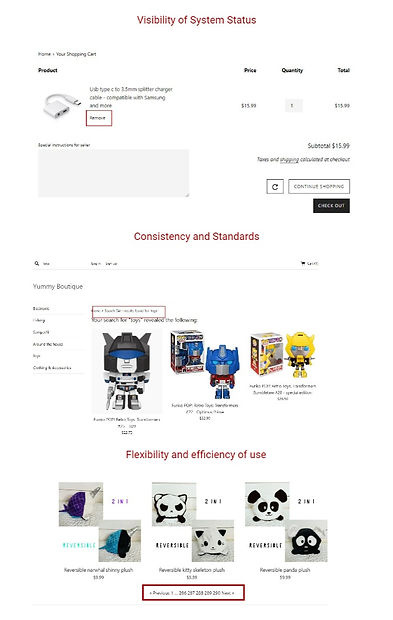
Starting With Heuristic Evaluation:
_edited.jpg)
Then Competitive & Comparative Analysis :


User testing & Interviews Synthesis
Define Phase

John is 39 years old
Born and raised in the PNW
He owns a local coffee shop
Loves everything nature related specially fishing & Hiking.
Strong sense of community.
Buy locally and volunteer a lot.
Say Hi to John.
After performing intensive research, it was time to identify our users' needs, paint points & ask ourselves, how might we make their experience better.
We started our define phase with affinity mapping, Restructuring our website map per the card sorting finding then we followed by defining personas,
John User Flow

Ideate Phase
I started of with few sketchs offering solutions to John's pain points
After refining our sketches we started wireframing our design, we all worked together to create a mid-fi prototype in order to test our design with actual users.
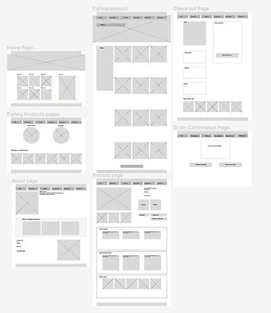
Prototype

I preformed usability test with 5 users and I asked them to complete a task
The Task :
Find the duck bait, read product description & reviews then buy it now.
Testing Findings
100%
were able to complete task within 3 mins.
66%
tried to search for the item in the search bar on the homepage rather than browsing items.
Users reported that the site was easy to navigate.
Average SUS score
91.6
Conclusions
What went well
-
Easy to navigate
-
100% task compilation with ease.
-
3 min task completion rate.
What Can be Improved
-
Functioning search button.
-
Choose delivery method in the product page rather than in the check out.
Next Steps
-
Auto layout.
-
Prospective user journey map
-
Another product page